Sonce
I got a chance to work with a large peer-to-peer energy trading crypto-currency companies, Sonce. Designing a suitable and informative webpage for buying and selling electricity was a big challenge for me. This case study documents the process designing the Sonce webpage for a company based in Ljubljana, Slovenia.
Webpage:
http://www.sonce.com/
The challenge
The Problem:
The task for this project was to design a corporate webpage which would present a professional image to visitors. This image should be an accurate representation of the company and all the elements needed to be arranged in a distinctive design and pattern. The webpage needed to capture the feel of the company and its purpose in a professional way.
My role:
As a contractor I regularly communicated with all key stakeholders while discussing the project with the product lead to ensure everything was moving forward at the pace required. I was hired to review the existing webpage as they were having trouble with user experience and build a new clean and simple webpage.
Research
After running through different scenarios and highlighting what I perceived to be the main pain points and errors that were causing UX issues, I asked the stakeholders for a meeting so I could learn more about their company vision and ideas. The main reason was to learn about the ‘business goals’, which would help me to fully understand the information architecture and the webpage functionality. This information enabled me to start creating User Personas and User stories to recognise the different user needs and expectations.
Once I had collated all the information, I started the project by sketching my ideas on paper, so I could do rapid development to get my ideas down quickly. My early iterations featured three main elements:
simple layout to build trust, communicating value and navigating visitors to the next step.
present the products as clearly as possible.
effective use of primary calls-to-action placement.
A well-designed webpage is important to compel visitors to dig deeper into the webpage and move them further down the funnel.

Working mainly with the product lead I mocked up a couple of ideas to run a series of lab tests before moving straight into A/B tests live on the site. Over 2 days we watched 10 users performing tasks we had set, so we could understand if our mapped assumptions were correct or incorrect. Our lab tests revealed that users didn’t know where or how to navigate on the webpage. Although it was pretty clear to us, they just couldn’t find the way without frustration. This gave us a clear view and provided us with good data in understanding our user goals.
Due to sensitivity of data I’m unable to show our clear findings.
Design
Once the client was happy with the corporate webpage design, I started designing the webpage in Figma, a browser based interface design application. Based on my sketches, I finalised the style guide.
The font I used was already chosen by my client – Geomanist, but to make sure the fonts were readable I used different styles and sizes.

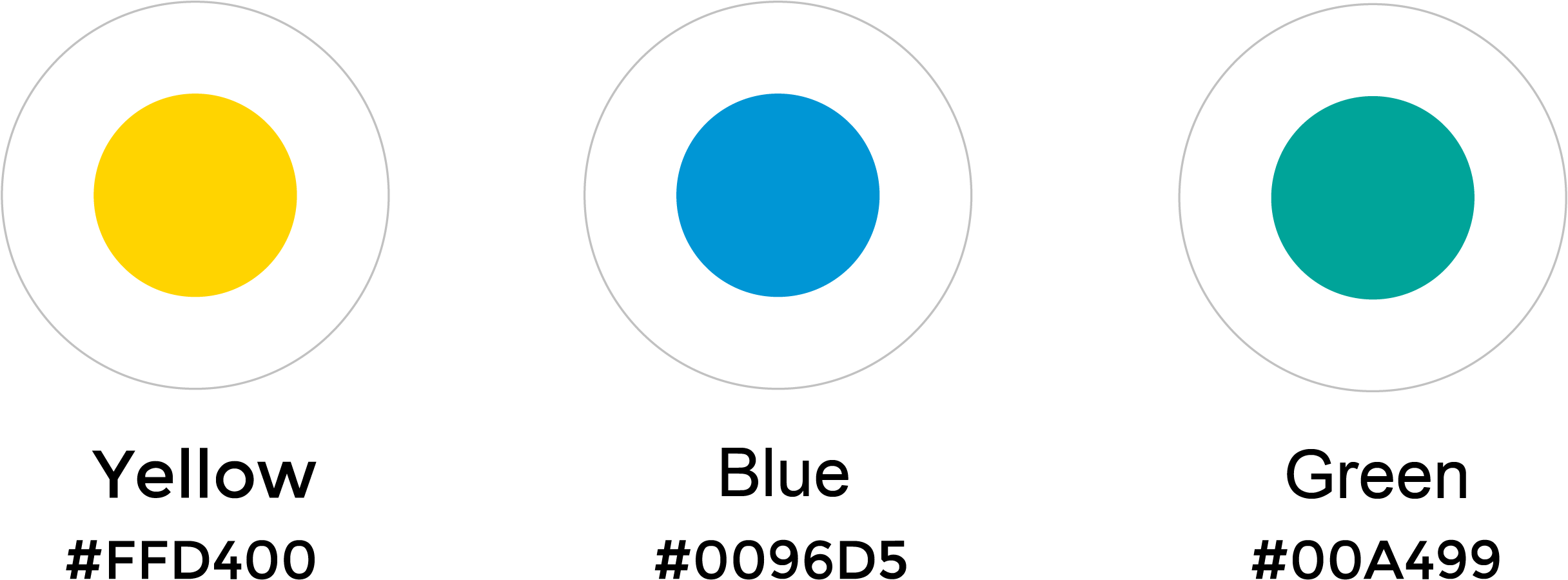
For the colour pallet I used their branding colours – yellow, blue and green, with a strong emphasis on their main colour, yellow.
Illustrations
When I already had the structure of the webpage, the next step was drawing the illustrations. I used the illustrations to present the services the company provides.

Hi-fi Wireframe
Once I got the final content I created a complete representation of the webpage on high-fidelity interactive prototypes.


